Component Design
Our 6 principles
for creating components
Dashboards are hard. It requires showing data in a way that users understand it with as little context as possible. Moreover, it should empower users to better monitor and manage their business. Whenever we think of new components, we try to stick to the following principles.
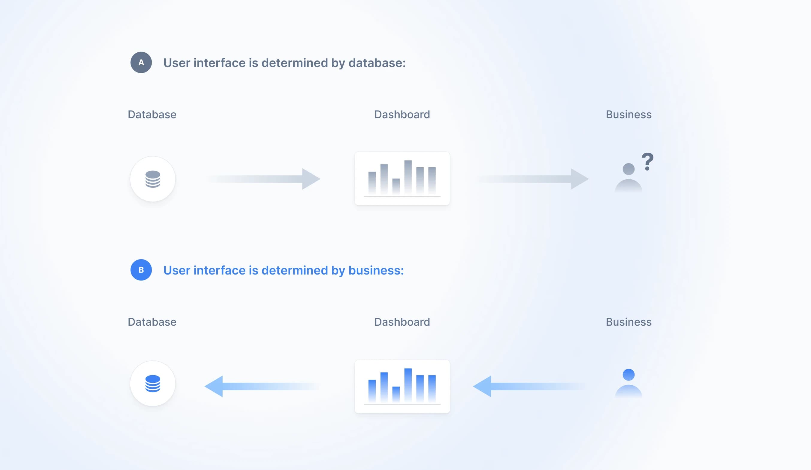
#1 Dashboards are a business problem, not a technical problem
If you google “Dashboard", 90% of the results will show you interfaces that are overloaded with visualizations and KPIs that hardly relate to each other. They may look nice, but often lack elements that contribute towards an overarching business goal. Sometimes it’s a 1:1 replication of the database shown as a table. No user-friendly UI or business value. Having a dashboard was the goal of creating the dashboard.
A good dashboard starts from the end-user perspective by asking what business problem can be solved with data. Then, you work your way back and identify which data is needed and how it can be used to tackle the business problem.
This way of thinking triggers new ideas that compound along the way and result in new visualizations that also make sense from a business perspective.
#2 Insights first, data second
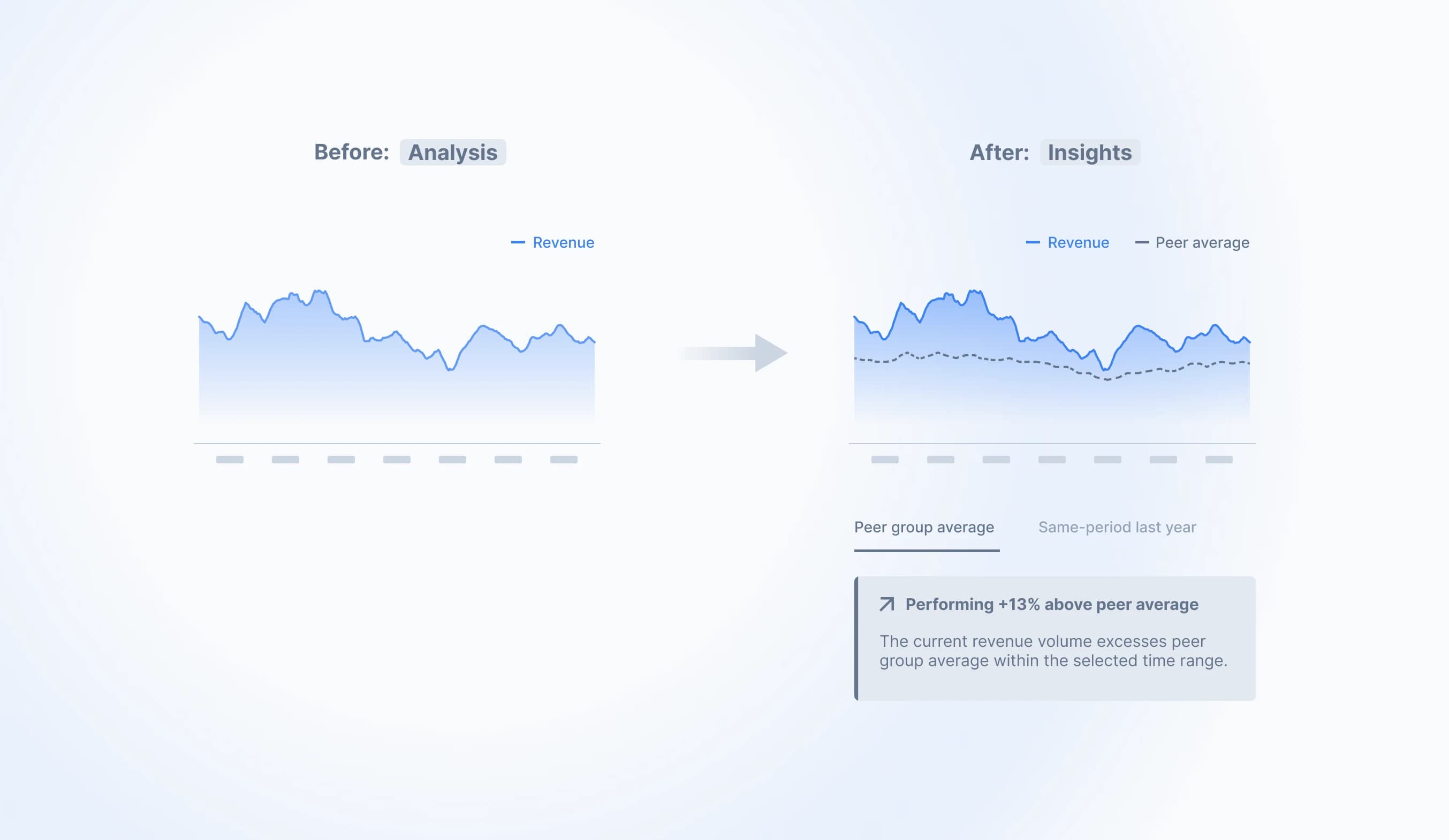
If you run a marathon, you mostly care about a few metrics: pace, distance, and heart rate. The analysis comes afterward or isn’t even important to some runners. This also applies to business.
Business doesn‘t want to study a fully-fledged dashboard over several pages. They want 2-3 key insights that summarize their business. The analysis is secondary and done irregularly.
This constraint builds the basis for our components. It requires visuals that are geared towards insights rather than analysis.
The example below shows how we came up with the Callout component. We complemented a time series chart with benchmarks. Callouts are then used to tell how the individual performance differs from benchmarks. This contextualizes data and reveals meaningful information to end-users.
#3 Compare the non-comparable
Interesting approaches to presenting information can be found everywhere. We actively look into other fields, sometimes completely outside of analytics, to transfer established concepts into our context.
What input components can we derive from Google Maps’ route direction display? What can we learn from Booking.com’s simple purchase process? What new KPI ideas can we transfer from our sports tracking app Strava?
To give an example, we were bombarded with the following chart back in our business school time: the BCG-matrix.
It‘s used to assign products (business units or other related objects) into 4 categories based on 2 assessment criteria, market growth, and market share. The outcome is an overview that helps businesses in making decisions about in which products to continue investing in or divesting from.
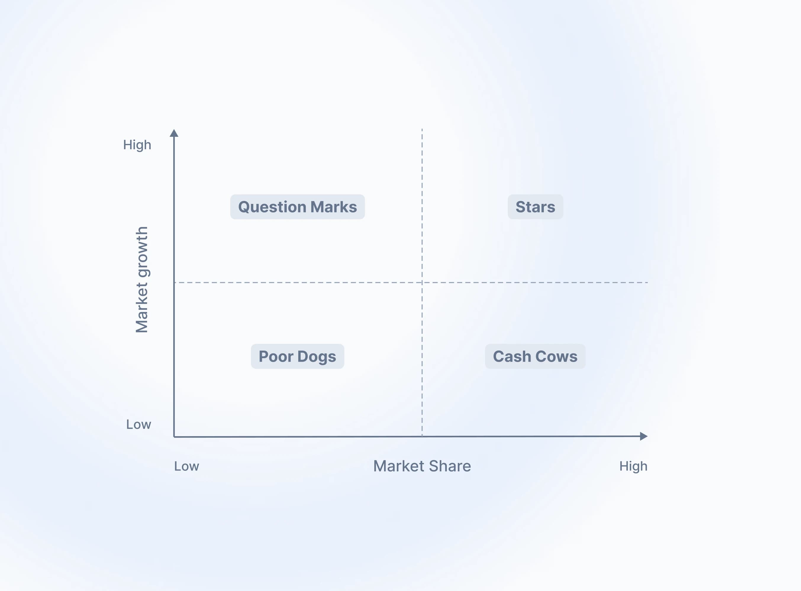
The result is also interesting from an analytics perspective and resonates with the previous statement: If you show this to users without any context, they immediately get information to act on, not data they need to study first.
| Category | Implication |
|---|---|
| Question Marks | Must be analyzed carefully to determine whether they are worth the investment |
| Stars | Require high investment, but can yield high revenue |
| Cash Cows | Require little to no investment, yield high revenue |
| Poor Dogs | Genererate little revenue, considered to be sold off |
We liked this concept so much that we decided to make our own case study out of it. The picture below shows the original matrix transferred to a risk assessment chart for a bank. Data points represent money transactions of customers which are assessed by risk (e.g. money laundry) and processing time. As a result, users (e.g. compliance analysts) get data with relevant context that tells them what to do next.
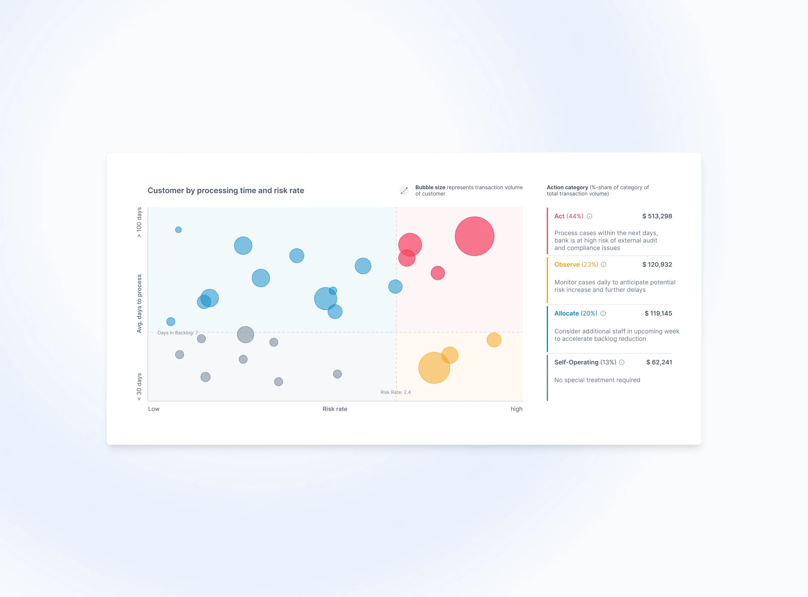
Looking for established concepts in other areas has become a game changer for us. It helps to rethink the way dashboards are built. It‘s still a common belief among developers to see tables combined with some KPI cards as good dashboards. Such approaches help to change this.
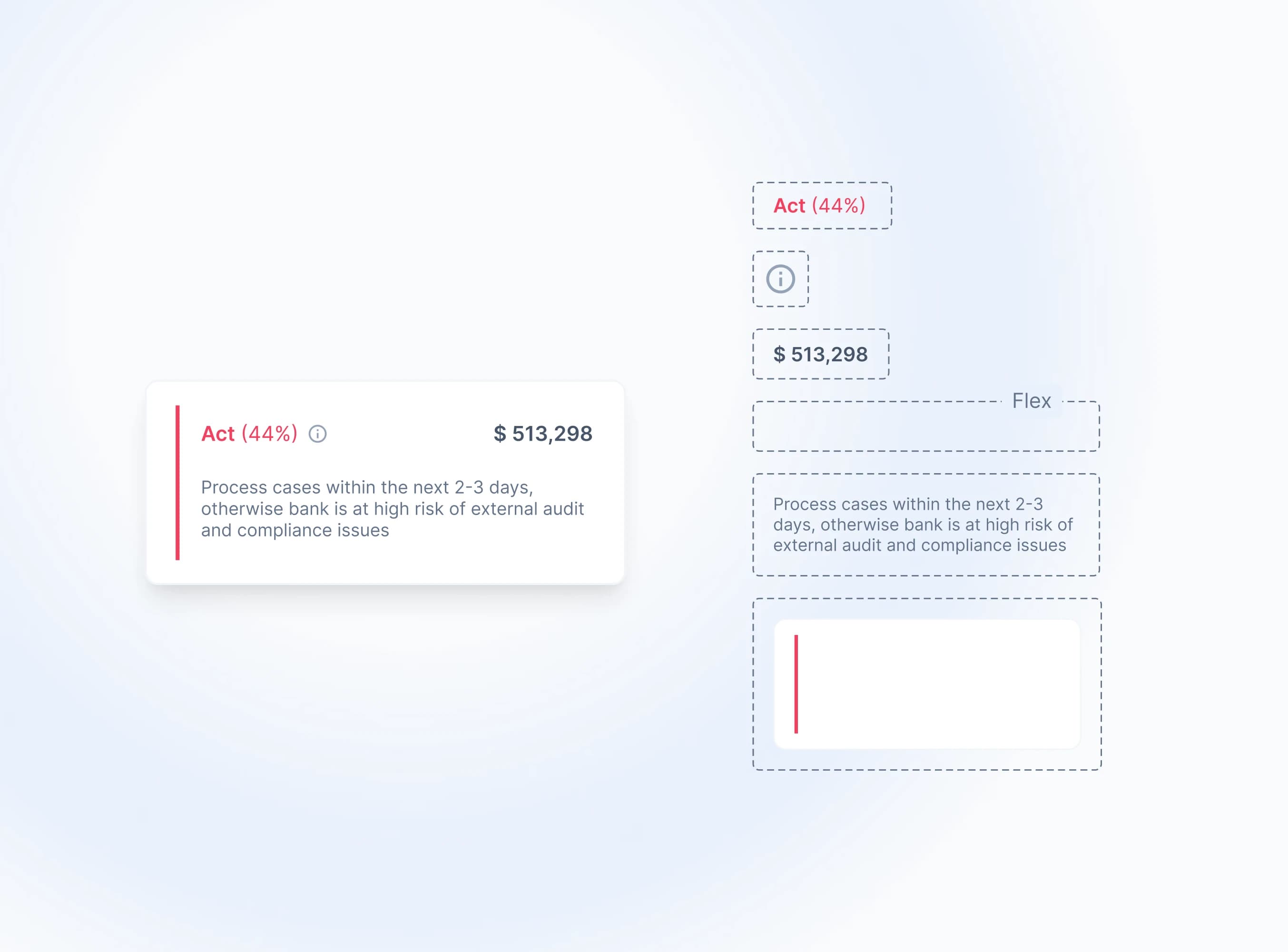
#4 Think of a use case first, then divide it into components
As you might have noticed in the previous example, we started by creating a use case first. This top-down method is more effective than starting with individual components. It focuses on the overall business perspective and also ensures that the components fit together well.
The illustration below shows how many individual components are used for just one card. We make our components as modular and atomic as possible. This gives developers full flexibility.
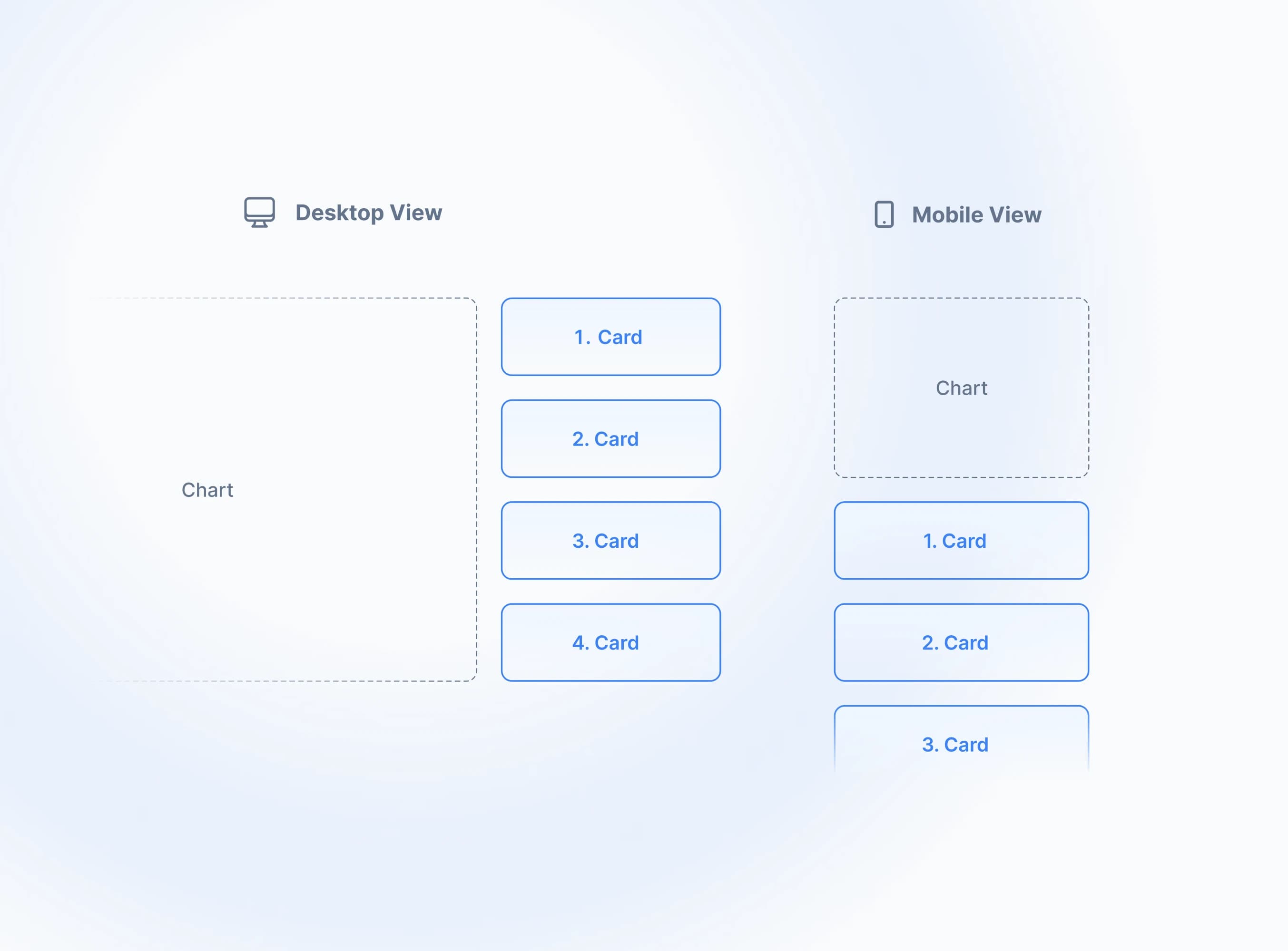
#5 Aim for edge cases, not for the best-looking composition
When creating components, we often tend to overlook in how many different ways they can be used.
Consider the picture below. Does it make sense to arrange the components for the mobile view the same way as in the desktop view? Obviously, it‘s too dense on mobile view. It might be more appealing to list the cards below the chart.
This led to the introduction of Grid component. Developers can wrap them over components and specify how components should be arranged for each screen size.
Another example is text or input in general. Components are usually designed with copy that has the perfect length just that it looks beautiful for the showcase. We always stress-test our components with long text and input. And in many cases, we need to do further adjustments to make them work well (e.g. truncate text if components collide with each other).
But sometimes we have to make our users responsible for how they use components. For example, if one uses the Tab components with plenty of options. It should not be expected to work well on smaller screen sizes (e.g. activate x-auto-scroll). Tabs are supposed to be used for desktop views, and if they are used on smaller screen sizes, fewer tabs should be used or even better, switching to a dropdown.
#6 Design with code
We don’t do any prior design work in tools like Figma. We directly jump into the code and prototype components from there. This can also apply to entire use cases as shown above.
Code eliminates vagueness better than concepts. It forces us to take care of logic while we can see how components would behave in real-life.
We code with Tailwind CSS in React. We sometimes even use Tailwind Play, an online IDE, to quickly formalize ideas with code.
New components are first put into a repository not shown to the public. Once finalized, they are sent to the public repository and refactored by Achilleas, such that design and logic can be updated by global variables.
This workflow arose due to different skills between us three. Severin and Chris are designers that can directly translate a design into HTML and CSS. Achilleas is the logic master and covers the heavy JavaScript parts.
Once the component is built, we will sometimes rebuild it in Figma for cover images or similiar stuff. However, we do not maintain a Figma library in the classic sense (e.g. auto layout, variants). Our public GitHub repository is our single source of truth. At this stage, it would be a cumbersome exercise that causes more inconsistency than efficiency. We also believe that it would not add value to our users. Our components are so opinionated that users want to prototype directly with code.
Jan 24, 2023